
Bringing Ideas to Life: The Art Direction Behind "The Red Line"
In the fast-paced world of creative development, true innovation often springs from a unique blend of strategic thinking, deep experience, and an innate understanding of visual communication. Having honed my craft as an award-winning Art Director at what was once the third-best agency in the world, I approach every project with a comprehensive perspective that transcends mere aesthetics. This expertise allows me to not only conceptualize but also execute designs that resonate deeply and achieve measurable results.
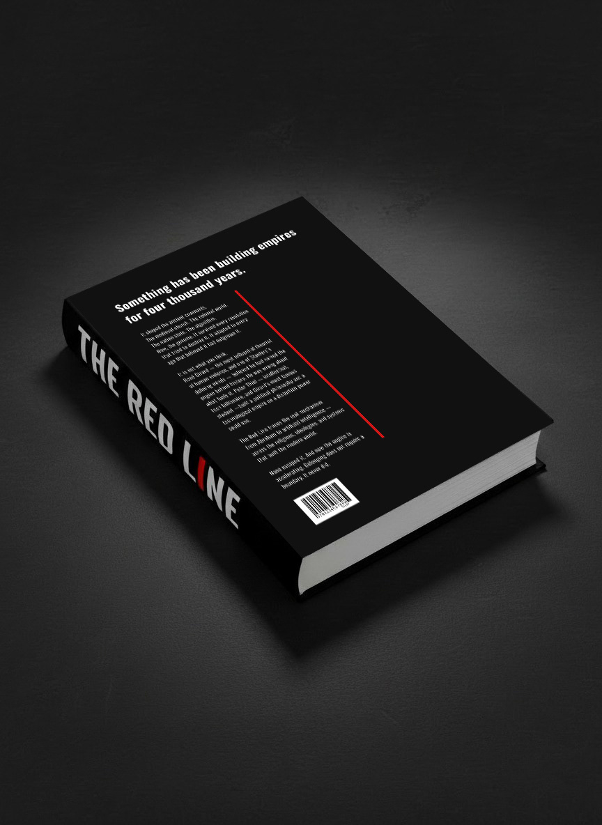
A recent project, "The Red Line," demanded exactly this kind of multifaceted approach. Tasked with creating a book cover that was both impactful and deeply symbolic, I leveraged my advertising background and design acumen to develop two distinct concepts. The goal was to encapsulate the book's profound message through compelling visuals that would stand out in a crowded market.
Concept 1: The Tactile Provocation
The first concept for "The Red Line" was born from a desire to create a physical, interactive experience for the reader. Drawing on the book's core themes, I envisioned a design where the traditional bookmark ribbon, a subtle element often hidden within the spine, is dramatically brought to the forefront. This signature red ribbon is not merely an accent; it's a bold, tactile stripe running vertically down the front cover, visually "tying down" the title. This physical integration serves as a powerful metaphor for the book's narrative—challenging established perceptions and bringing what has been assumed or overlooked into clear view. The design carefully considers how this physical element would translate, even extending into the book as a permanent bookmark.
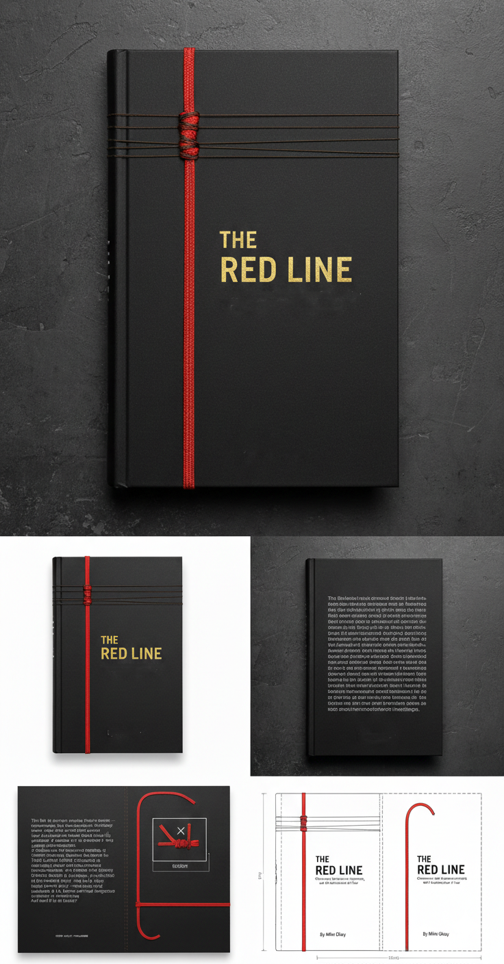
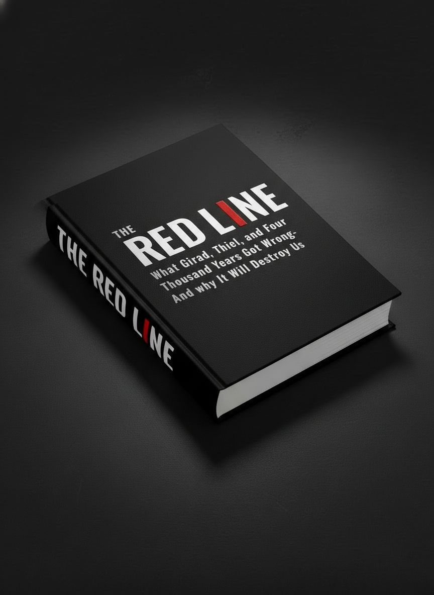
Concept 2: The Digital Icon
Understanding the need for versatility in today's digital landscape, I simultaneously developed a second concept, ensuring the core message remained potent even without the tactile elements. For the digital cover, the striking visual impact of the red line was maintained by transforming the "I" in "LINE" into a vibrant red stroke. This subtle yet effective shift retains the central motif, making it instantly recognizable and impactful across all platforms, from e-readers to online thumbnails.
Both concepts were meticulously crafted, executed, and presented to the client for testing. The results affirmed the power of a trained eye and strategic design: my concepts were ranked as the best, proving that thoughtful, experienced-driven creativity consistently outperforms generic approaches.
This process is a testament to the value I bring to clients. While simultaneously signing NDAs for new opportunities, crafting proposals, and curating photographic selections for my agent, I seamlessly integrate high-level creative direction and hands-on execution. This comprehensive skill set allows me to streamline processes and significantly reduce the large agency costs typically associated with such specialized work. An "eye" — an eye trained by years of strategic thinking and award-winning design — remains an irreplaceable asset, delivering nuanced, effective communication that AI, while powerful, cannot yet replicate.
(You'll notice we're keeping some specifics under wraps as the book hasn't hit shelves yet!)